BURST Oral Care
Role:
UI / UX
Digital Branding
Team:
ico Design Partners
2017 to present
I’ve been fortunate to have worked with BURST Oral Care right from the very beginning of their journey—from a start-up with one product offering to one of the most successful direct-to-consumer brands in the US and Canada. Throughout their development, I have led the user experience and visual design across all of their digital platforms, including their e-commerce website, customer service portal, and brand ambassador iOS app. We’ve gone through two rebrands and constantly seek to use analytics to improve design and conversion.
A deep dive in Google analytics to understand customer behaviour
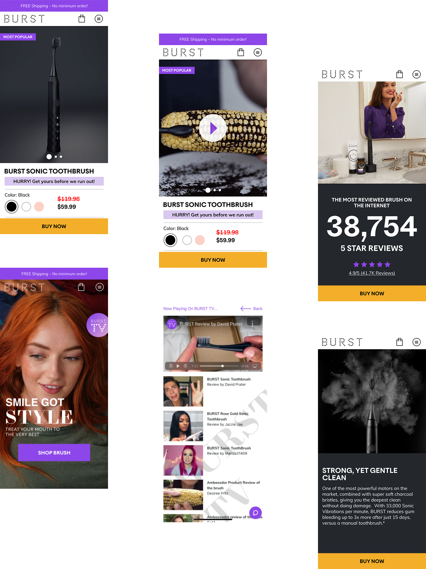
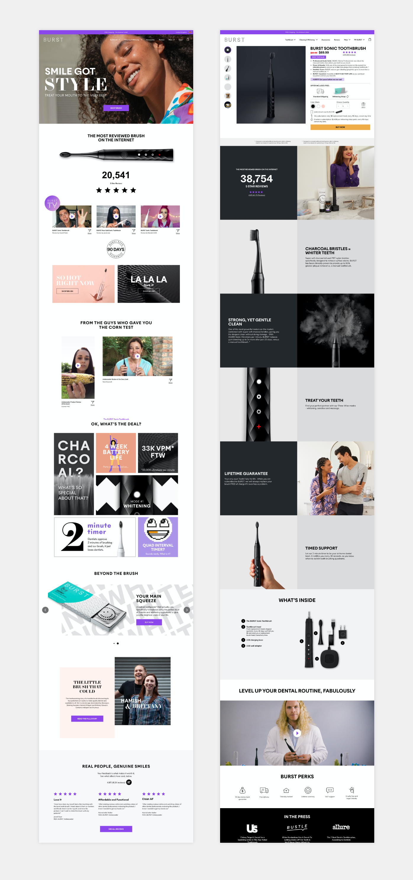
As part of the larger 2.0 rebrand, the BURST team came to me with an interesting problem: a majority of first-time users were landing on the toothbrush product page from an online ad, but there was a significant drop-off rate. To understand what was going on, I followed the customer journey and discovered the marketing team had created Facebook ads using a video of a dental hygienist demoing the BURST toothbrush on a coffee soiled corn cob. These ads were highly effective at driving traffic, but how could we solve the massive drop-off?
With 95% of sales conducted on mobile devices, our redesign took a mobile-first approach in which we sought to utilise similar user-generated demos on the product page, creating a design and content overlap. Collaborating with their marketing team, we also discovered an untapped repository of user-generated content from YouTube that was not being leveraged to drive sales. We decided to take a calculated risk and incorporate this content on the e-commerce site in the form of BURST TV – a YouTube inspired playlist of curated user reviews and brand ambassador demos. A conscious move away from a traditional e-commerce storefront homepage, this approach proved highly effective.
Results and reflections
The juxtaposition of user-generated videos and clinical data, all infused by the new visual rebrand, allowed us to bring out the irreverence and accessibility of the BURST brand while also demonstrating its effectiveness by real customers. Mobile conversion coming from online ads increased. And we have now seen a growth of over 350k subscribers with a 96% retention rate which is still going strong. During this process, I've learned the importance of understanding where user traffic is coming from, and to include this in designing the end-to-end customer experience in collaboration with the marketing team. Furthermore, we took a new, more daring approach partly informed by brand values as well as Google analytics.
Mapping user flows to identify opportunities to boost sales
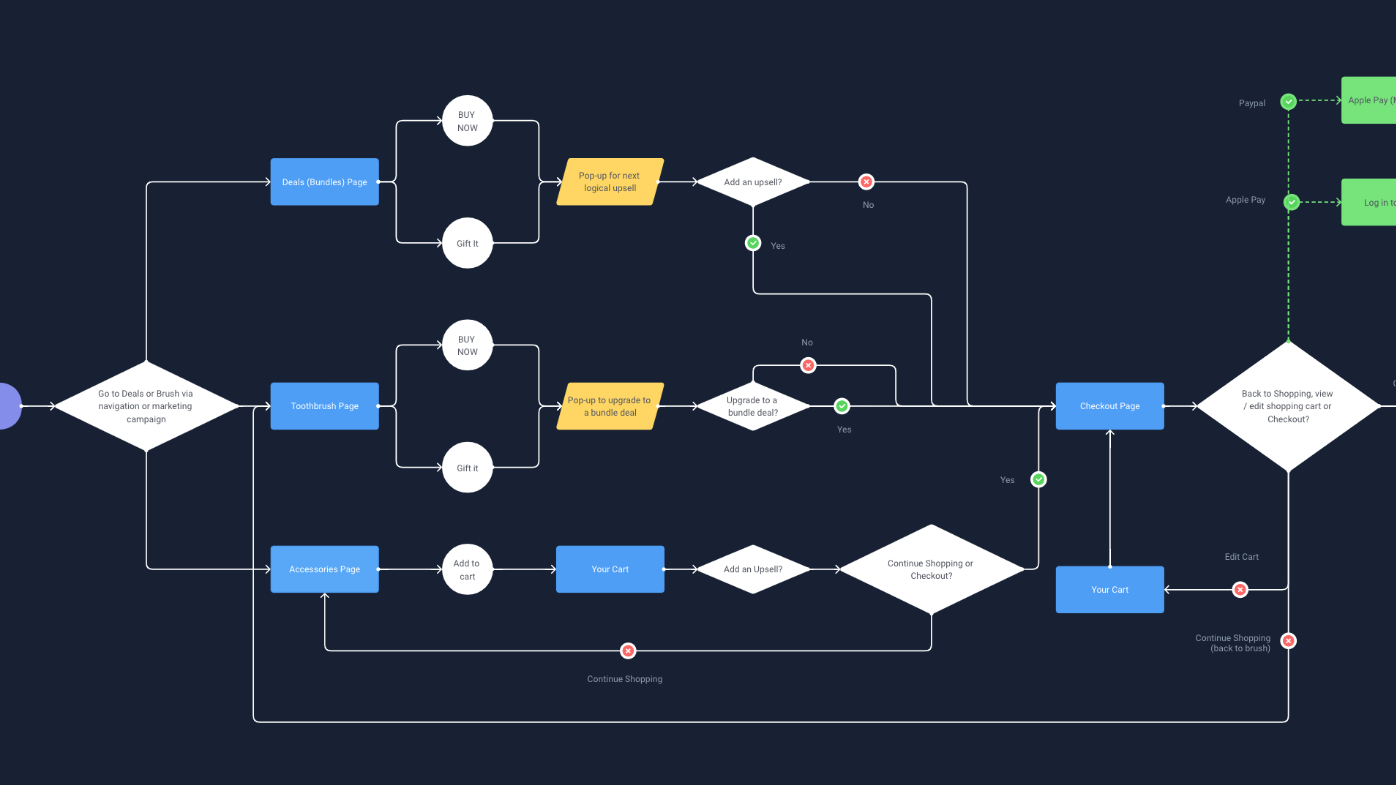
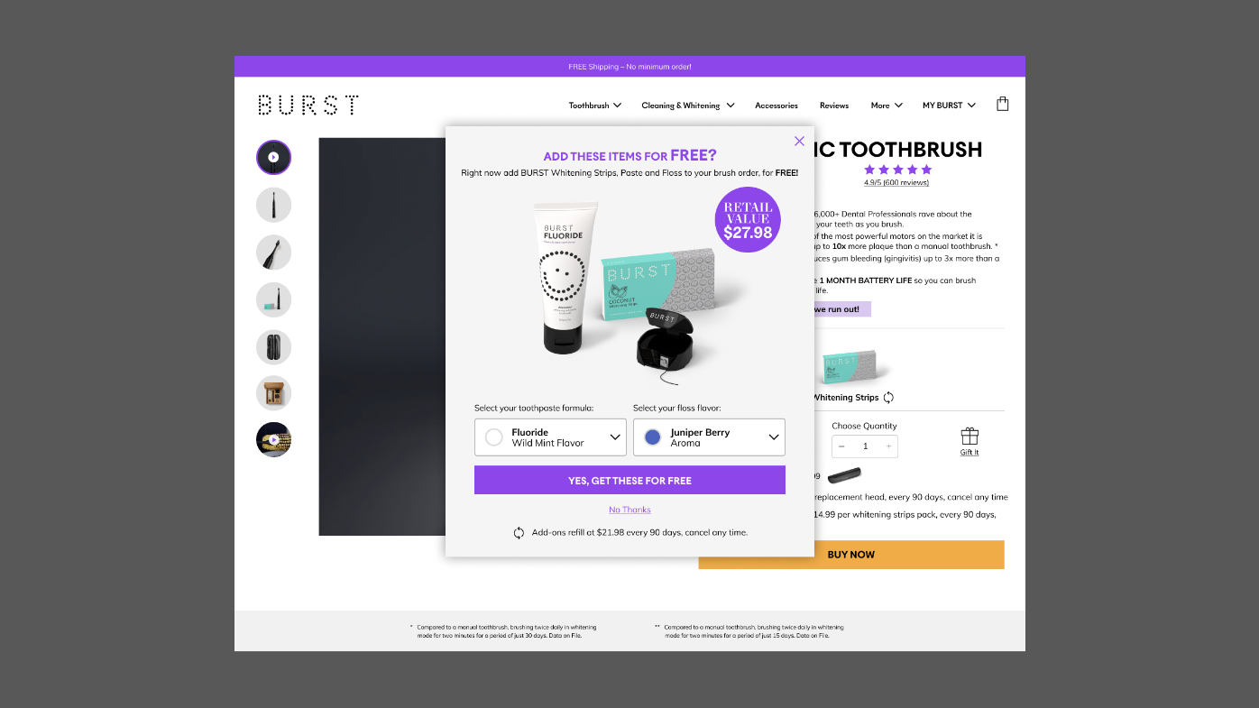
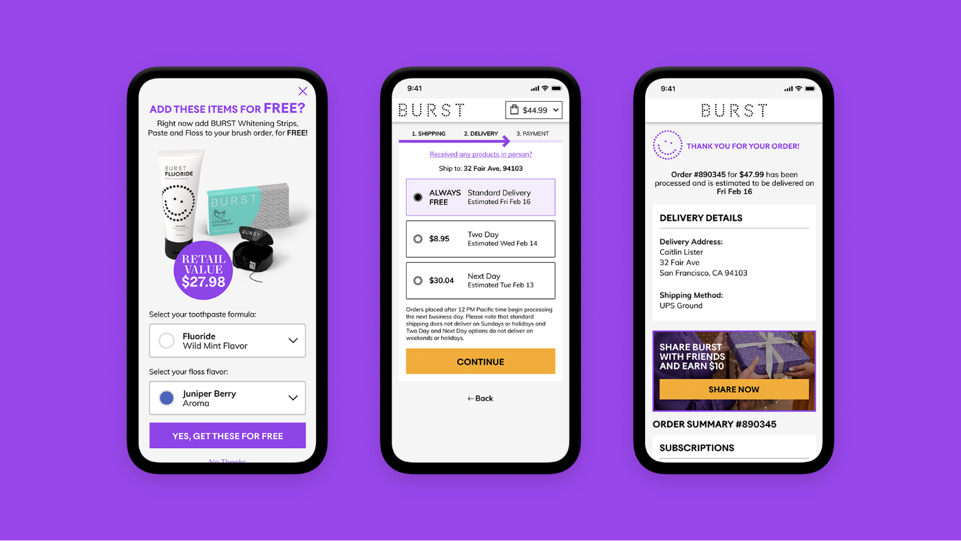
As part of BURST's 2.1 redesign phase, we were tasked with redesigning the checkout flow for ease of use on mobile and increasing upsell conversion. As a subscription-based company, the checkout flow had many legal variables to account for, such as required legal text and a complex gifting option. As part of the brief, the product manager also identified an opportunity to improve upsell conversion, as the upsells in the checkout cart and on the confirmation screen were not performing very well. An upsell pop-up we tested did convert well. I was then tasked with using this data to improve the overall checkout flow while increasing upsell conversion.
I mapped out user flows in a site-wide flowchart to identify opportunities for pop-up upsells. This allowed us to visualise the logic behind our thinking and pinpoint checkout funnels. We also did an audit of mobile optimised checkout screens from various e-commerce competitors to scope out current best practices. We streamlined the checkout by reducing the number of checkout screens to just three, allowing for Express Checkout, and moving the account creation process to the end of the flow instead of having it be the first prerequisite step to proceed.
Results and reflections
Following the update, we noticed an increase in upsell conversion and overall conversion. There was also a significant decrease in customer support tickets regarding purchasing. During this process, I learned the importance of collaborating with product managers to understand customer behaviour during checkout.
Helping the customer support team become more productive
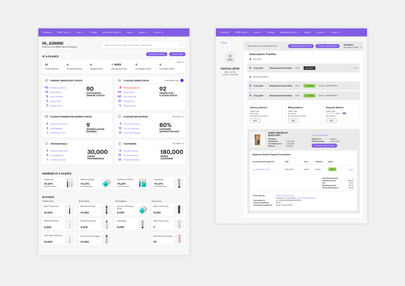
The BURST customer service team was struggling to respond to inquiries using their customer support portal: a poorly skinned relational database that was not fit for purpose.
To improve their experience, I undertook interviews with the team to understand the scope of the Helpdesk tickets and any associated pain points using the portal. Based on this requirement gathering, I charted the site-wide flowchart and rapidly prototyped a more user-centred experience and tested it with the team. After several iterations, I applied a new skin to the wireframes and worked with the development team to roll out and QA the new interface.
Results and reflections
The new system has streamlined their workflow, making it easier to review statuses, locate records and fix problems. As with all systems and growing businesses, constant monitoring and subsequent iterations are required.
Helping brand ambassadors generate revenue and build an online community
Central to the BURST story are their brand ambassadors—dental professionals who recommend BURST products to their patients. For the MVP, they needed a tool to help track their recommendations and rewards.
Via user surveys and focus groups with product managers and brand ambassadors, we gathered and prioritised user needs to design an iOS and Android native app. We outlined use cases, user flows, and designed a wireframe prototype. Through further user testing and subsequent iterations, we crafted an experience that utilised gamification to nurture an engaged community. We further designed opportunities for managers and ambassadors to receive company-wide updates and communicate with their colleagues via regional forums and direct messages.
Results and reflections
With the use of an app to help them conduct business and create a community, the BURST brand ambassadors have proven to be a vital part of the BURST Oral Care enterprise. Not only has this increased revenue, but it also created a nationwide community of hygienists with their own annual gathering called BURST Con.
© Kwong Li Design 2024