Cloud11
Role:
UI / UX
Digital Branding
Team:
ico Design Partners
2019 to present
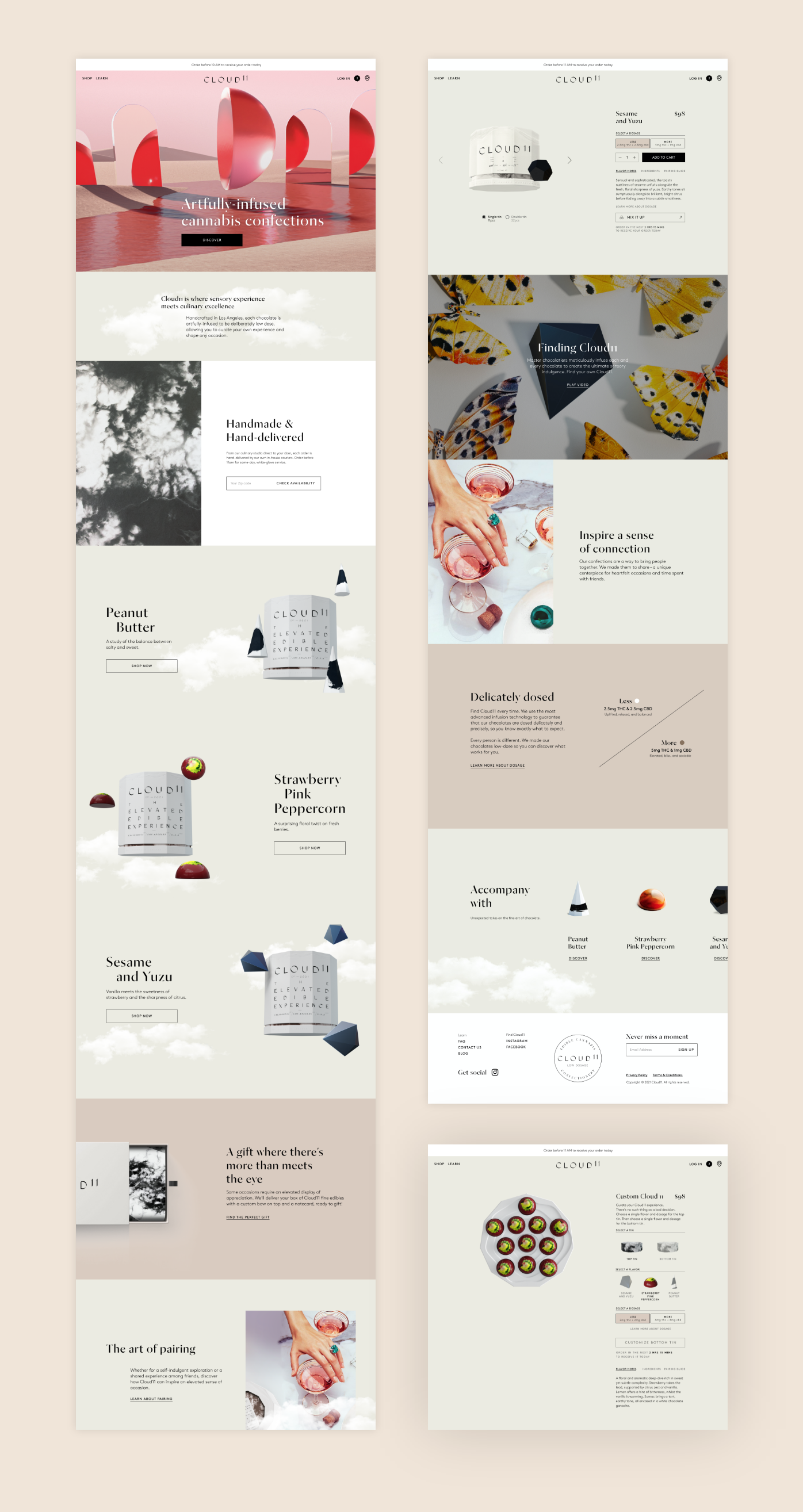
The 2016 legalisation of marijuana in California birthed the rapid rise of a new highly profitable industry: cannabis edibles. With companies scrambling to take advantage of this new market, most spent little time and resources on branding and online customer experiences. Within this ultra-generic marketplace, Cloud11's vision was to make the industry accessible and appealing to a new audience of female professionals. To do this, we helped them create a distinct, luxury brand of cannabis infused chocolates and a digital experience which allowed users to book delivery of the product, by hand, within the Los Angeles area.
The brief: where luxury and cannabis meet online
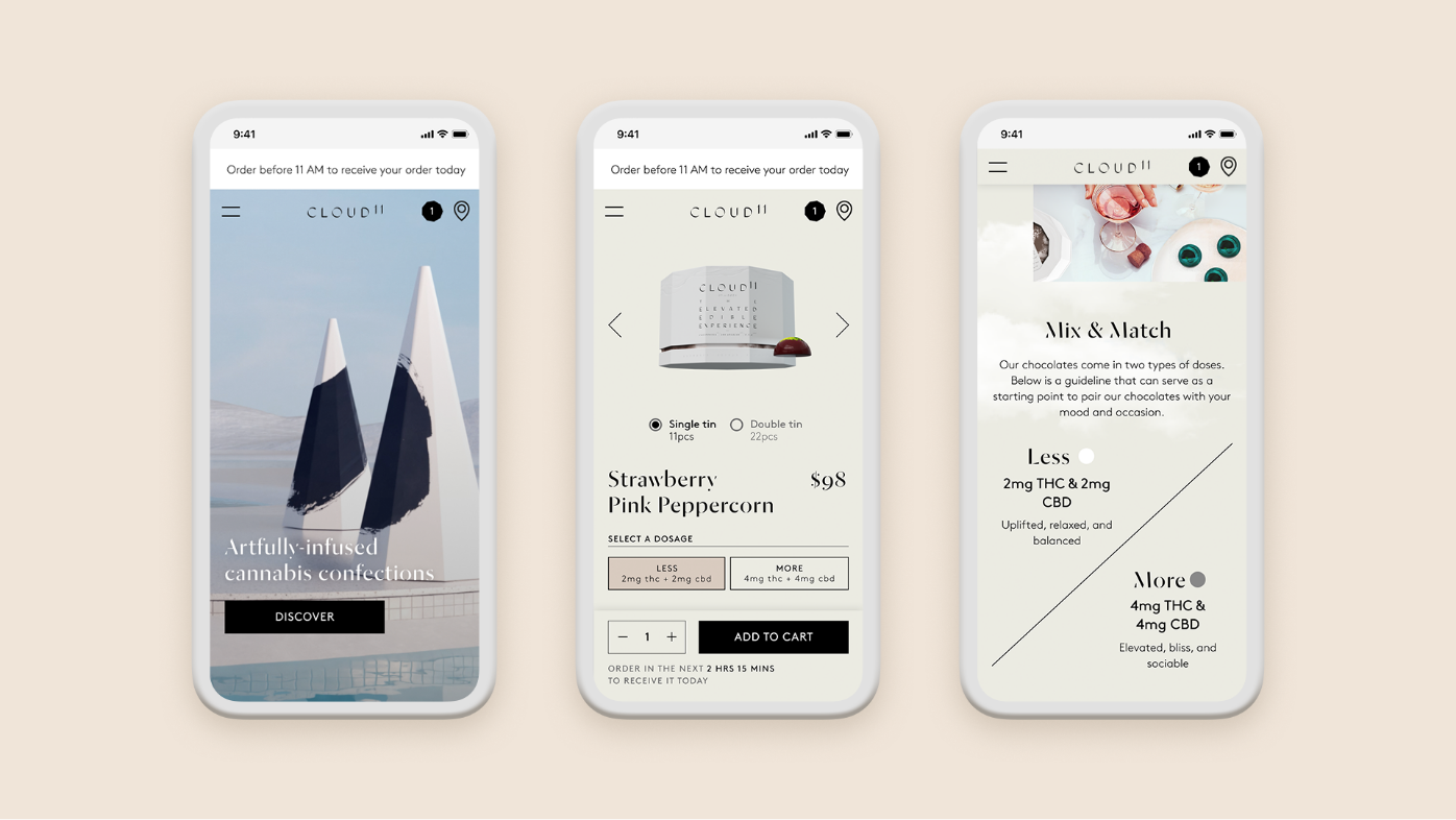
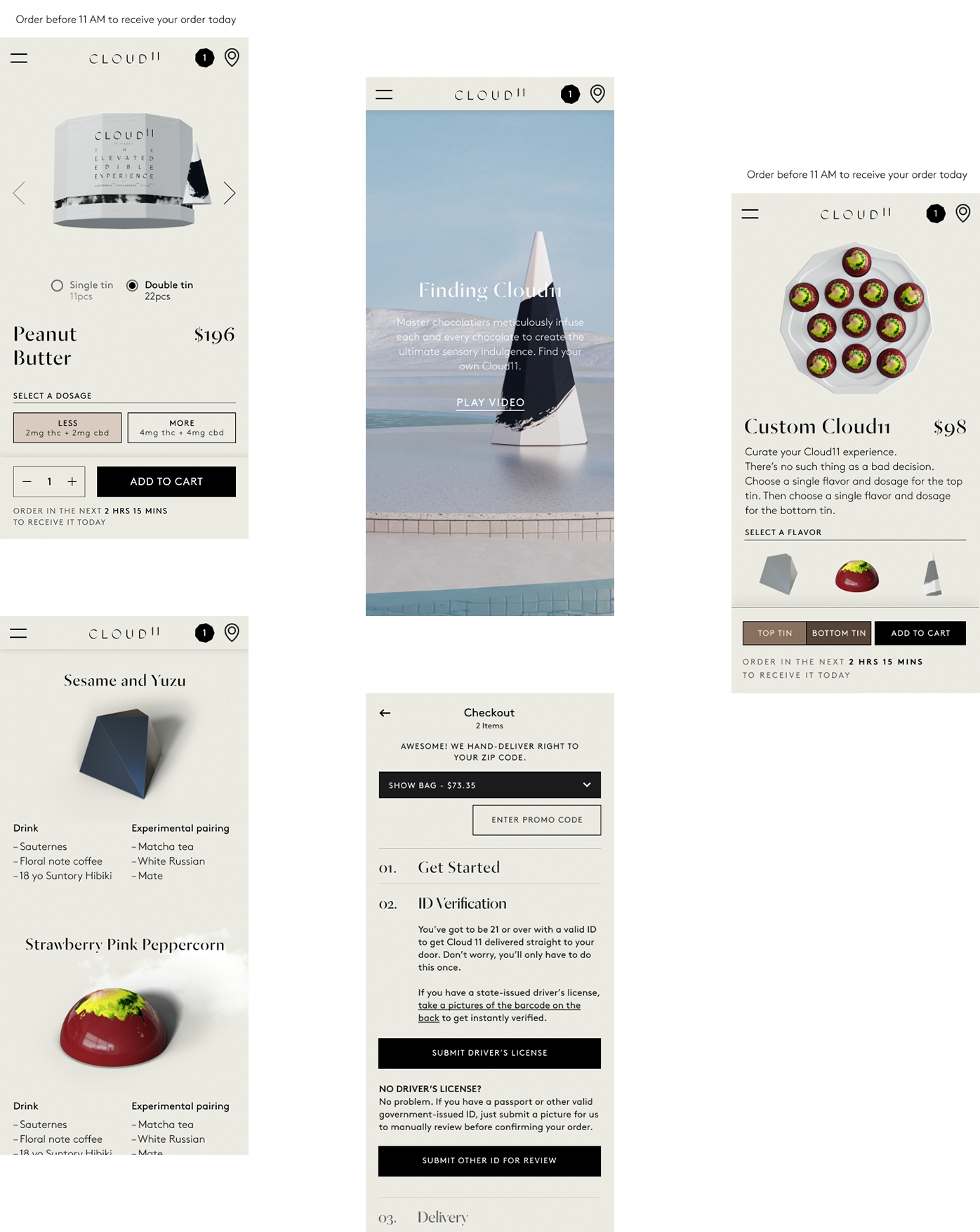
As Cloud11 looked to target upper middle-class women living in the most exclusive Los Angeles area zip codes, the project came with a set of challenges. It was important to educate customers who were previously unfamiliar with cannabis on dosage levels, allow them flavour customisation, and ensure adherance to California’s strict laws governing online cannabis sales–all while providing an intuitive mobile-first e-commerce shopping experience.
Research and journey mapping to create a unique, easy-to-use experience
Working with founders Nick Pritzker, Andrew Freeman and Drew Gosselin, we fleshed out the user personas of their ideal primary and secondary customer base: 40-year old affluent mothers and 30-year old career-focussed women. In order to understand the buying habits of this group within such a new, niche market, we researched the customers' current lifestyle, brand-loyalty, exposure to cannabis, key buying considerations and potential barriers to purchase. I followed the general principle that, when encountering a new product, a customer immediately wants to know the following: what the product is, why they should buy it, and how they buy it.
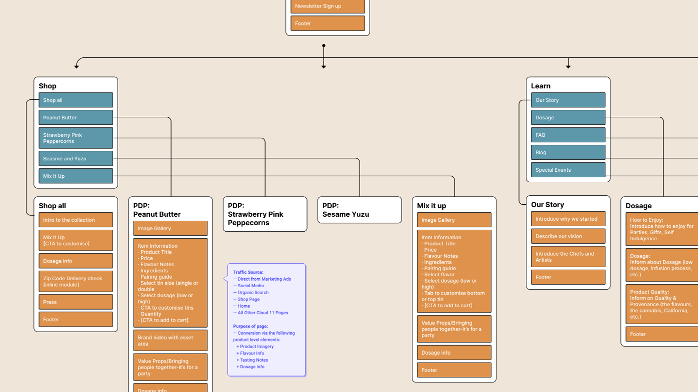
For key pages, I mapped out where the user would be coming from and the perfect stages to enable education about the product, and to address any concerns they may have. This allowed us to create a sitemap with content blocks and a structured hierarchy for our content designer.
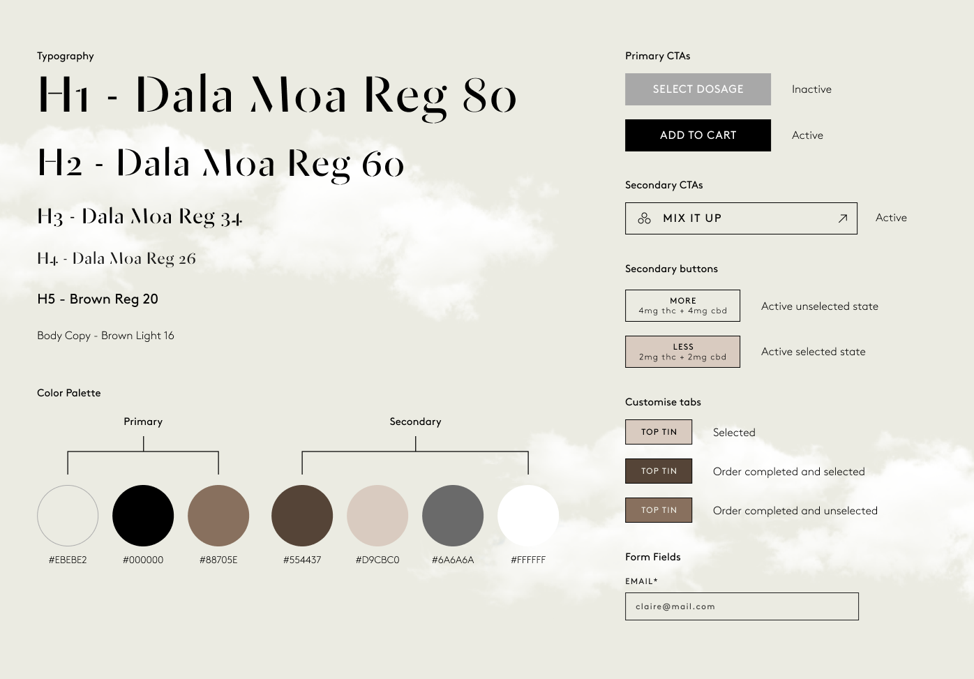
One of the biggest challenges encountered during wireframing was to design a process that would allow customisation of both flavours and dosages in a double-layered tin. After prototyping a variety of UI's, I undertook user testing to ensure we were creating the most intuitive UI possible.
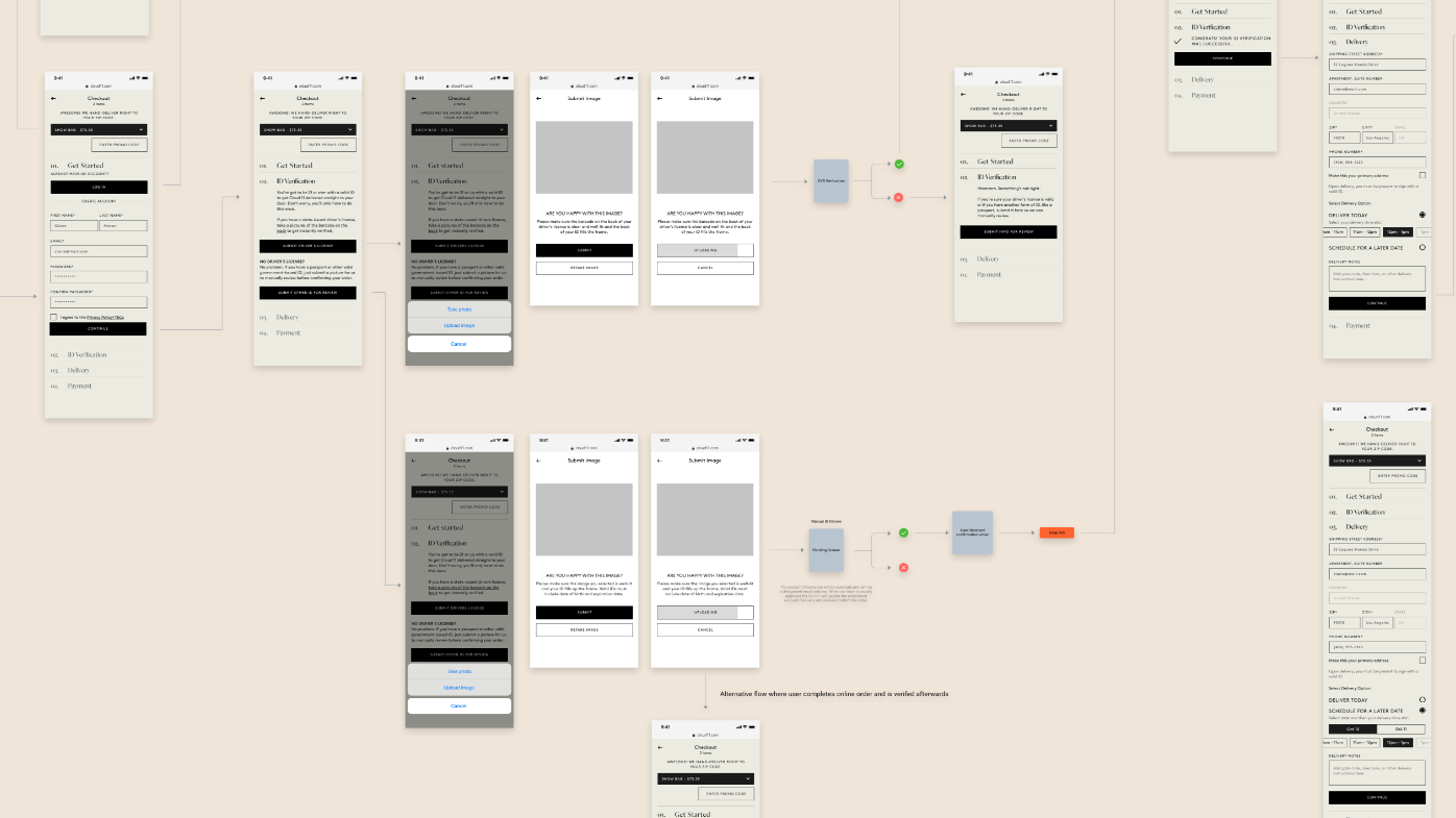
The checkout process also proved to be a challenging endeavour. According to California law regarding online cannabis sales, customers are first required to go through an ID verification process. They are then only allowed to pay via ACH bank transfer or pay-in-person on delivery. After encountering 3rd party software difficulty, our client opted for the simpler pay-in-person on delivery method. To ensure the checkout process wasn't too painful due to these restrictions, I mapped out the checkout flow in a flowchart to identify possible painpoints and designed a minimal UI.
Results and reflections
In a new, young, and unchartered market, we were able to take Cloud11 from an idea to a stunning, fully branded digital experience. Working with D2C start-ups can be tricky—often, they're still developing their product(s) while we are building their brand and online experience. Collaboration with the client is always essential, but in this project, I knew that collaboration with a content designer would be vital to the success of the website, too. Following the user journey to create relevant content blocks was fundamental to our end result. We were also fortunate to work with a very talented CGi artist, Simon Kämpfer, who brought the Cloud11 product to life through beautiful (and mouth-watering) imagery under the art direction of our brand designers.
© Kwong Li Design 2024